超谈 SwiftUI:探究和实践 “隔山喂牛” 式内建 API 的实现
前言
此文为「超谈 SwiftUI」系列的文章,主要输出一些使用 SwiftUI 开发几个 apps 后的一些心得、经验和踩坑记录。希望能帮助到你。
本文将剖析 SwiftUI 的一些官方内建 API 可能的实现方式,以及实践如何应用到自己写的自定义 SwiftUI View 上。
“隔山喂牛”?
在直接解释何为 “隔山喂牛” 式的 API 风格前,先来思考一下,当我们设计一个 View 的 API 的时候,我们到底在设计什么——一个 View 有它本身的主要功能,能通过自身或者跟外部 View 的组合,来实现一个预期的功能。除了能满足功能外,View 本身是描述呈现在屏幕上的元素,自然有它的外观,一个经过封装组合实现的自定义 View,有着自身 UI 设计的同时,也允许在外部(即使用方)对其做些 UI 上的定制——但这不是使用方必须做的。
上述这段话,对于很多 SwiftUI 框架内的内建 View,也是适用的。这也是官方在 2022 年 WWDC 上的关于 The craft of SwiftUI API design: Progressive disclosure 里提到的。
对 Button API 设计的探究
以 SwiftUI 里的 Button View 为例,此 Struct 本身存在多个构造函数,但都是围绕两点来设计的:让使用方定义点击后的行为,以及本身 Button 上的 Label 区域的显示内容。
Button("A button") {
    // action
}

Button {
    // action
} label: {
    Text("A button")
}
上述的代码,在 macOS 上会产生这样一个样式的 Button。在 macOS 上此按钮自带了一个带背景色、描边和阴影的圆角矩形背景,不论你在 Label 里传入什么 View,所绘制的 Button 都会带有这样的背景——但你会注意到,在 macOS 的系统层面,这个按钮的样式遍布从官方 app 或者系统组件的地方,采用最简单的方式构造一个 Button,得到的是最贴合系统 UI 设计的样式。如果我们需要更进一步地自定义,那么可以这样做:
Button("A button") {
    // action
}.buttonStyle(.plain).foregroundColor(.red)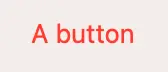
这里我们在 Button 构造完毕后,紧跟着使用了 buttonStyle 来设置使用最普通的 plain 样式,并接着使用 foregroundColor 来指定前景色为红色。
在没看到 SwiftUI 的 API 风格前,对于设计这么一个拥有多个可定制属性的 Button 来说,最直观的做法,是提供这样的构造函数:
init(buttonStyle: ButtonStyle,
     foregroundColor: Color,
     label: @escaping () -> View,
     action: @escaping () -> Void) {
    self.buttonStyle = buttonStyle
    self.foregroundColor = foregroundColor
    self.label = label
    self.action = action
}
然后可以通过添加参数默认值的方式,来提供默认外观,后期新增可定制的属性的时候,往后面加参数就可以了。对于自定义项较少而且相对变动较少的 View 来说,这是最简单也是推荐的做法。但是这种方式后期的扩展性比较弱,拿 Jetpack Compose 的 Button 为例子:
@Composable
fun Button(
    onClick: () -> Unit,
    modifier: Modifier = Modifier,
    enabled: Boolean = true,
    interactionSource: MutableInteractionSource = remember { MutableInteractionSource() },
    elevation: ButtonElevation? = ButtonDefaults.elevation(),
    shape: Shape = MaterialTheme.shapes.small,
    border: BorderStroke? = null,
    colors: ButtonColors = ButtonDefaults.buttonColors(),
    contentPadding: PaddingValues = ButtonDefaults.ContentPadding,
    content: @Composable RowScope.() -> Unit
): Unit
除了基本的 onClick 和 content 外,还提供了诸如 elevation、shape、border 等自定义参数,尽管都是有默认值的参数,但使用的时候,即便有 IDE 的帮助,使用起来可能也不是很直观。
回到 SwiftUI 的 Button,你会注意到,上面的 buttonStyle 和 foregroundColor 方法,它们的签名是:
@available(iOS 13.0, macOS 10.15, tvOS 13.0, watchOS 6.0, *)
extension View {
    public func buttonStyle<S>(_ style: S) -> some View where S : PrimitiveButtonStyle
}

@available(iOS 13.0, macOS 10.15, tvOS 13.0, watchOS 6.0, *)
extension View {
    @inlinable public func foregroundColor(_ color: Color?) -> some View
}
需要注意的是,这两个方法,都是给 View 添加的扩展方法。而 View 本身,是 SwiftUI 内的根基——View Protocol。这意味着我们可以在任意 View 上适用这个方法。那么问一个问题:如果我对一个非 Button 类型的 View(但是它的子 View 会有 Button) 设置了 buttonStyle,那么 里面的 Button 会被设置上这个 buttonStyle 吗?
VStack {
    Button("Inner button") {
        // action
    }
}.buttonStyle(.plain).foregroundColor(.red)
答案是:可以的。对一个 View 来使用 buttonStyle,等同于把里面直接和间接子 View 的 buttonStyle 都设置了,如果一个子 Button 会有自己的样式,那么可以通过对其自身设置 buttonStyle,那么就不会受外部设置影响。
到这里为止,可以思考一下,我们通过怎样的方式来实现这种我称之为 “隔山喂牛” 的设计——我们不通过构造函数的方式来传入自定义 View 所需的参数,而是通过该 View 所在的 View 层级任何一个包含该 View 的路径调用设置参数的方法,来实现改变该 View 的属性。
其实这里有点像链式 API 调用的设计,但不同的是,SwiftUI 里是通过对 View Protocol 添加扩展方法来实现的——这意味着,在调用该方法的时候,是不知道该 View 的具体里类型的。更进一步地,因为 SwiftUI 大量适用了 Opaque Type 的设置,在调用了 View 的扩展方法后,返回的 View 的类型都已经产生变化(方法的返回值是 some View,表示编译器知道这个是什么 View,但是我们开发者不能知道),同时也可能已经变化为一个非常复杂的 View(思考一下,当使用 if-else 返回一个 View 的时候,到底是返回了一个怎样的 View?)。
利用 Environment 来实现跨 View 层级设置参数
针对上述的 SwiftUI View 的 API 设计,我的答案是:利用 Environment API 来实现。
先来看一个任务:
假设要设计一个 CheckedButton,需要外部传入 Checked 状态,来控制按钮的样式。同时可以直接设置里面的 Icon 和文字的前景颜色,以及背景颜色。如果都放到构造函数来实现,那么该 View 的实现是这样子的:
struct CheckedButton: View {
     /// Properties...

    init(checked: Bool,
         labelText: String,
         labelForegroundColor: Color = Color.white,
         iconForegroundColor: Color = Color.white,
         backgroundColor: Color = Color.accentColor,
         action: @escaping () -> Void) {
        self.checked = checked
        self.labelText = labelText
        self.labelForegroundColor = labelForegroundColor
        self.iconForegroundColor = iconForegroundColor
        self.backgroundColor = backgroundColor
        self.action = action
    }

    /// body...
}
使用上:
CheckedButton(checked: true,
	      labelText: "A checked button",
              labelForegroundColor: .white,
              iconForegroundColor: .red,
              backgroundColor: .accentColor) {
    // action
}
我们接下来,需要按照这样的原则来优化 API:
- 对于一个
CheckedButton,它的核心功能是根据 Checked 状态来控制图标的显示和隐藏;以及显示一个文本以及让外部处理点击事件。 - 它的文字和 Icon 前景色、背景色,内部都提供默认值,但是外部可以通过后续函数的调用来实现对这些属性的改变。
我们目标,是要让这个 CheckedButton 的 API 变成这样子:
struct CheckedButton: View {
    /// Properties...

    init(checked: Bool,
         labelText: String
         action: @escaping () -> Void) {
        self.checked = checked
        self.labelText = labelText
        self.action = action
    }

    /// body...
}

extension View {
    func checkedButtonLabelForegroundColor(_ color: Color) -> some View
    func checkedButtonIconForegroundColor(_ color: Color) -> some View
    func checkedButtonBackgroundColor(_ color: Color) -> some View
}
在使用上:
CheckedButton(checked: checked, labelText: "A checked button") {
    // action
}.checkedButtonBackgroundColor(.primary)
    .checkedButtonIconForegroundColor(.white)
    .checkedButtonLabelForegroundColor(.red)
你甚至可以对多个这样的 CheckedButton 同时设置:
VStack {
    CheckedButton(checked: checked, labelText: "A checked button") {
        // action
    }

    CheckedButton(checked: checked, labelText: "Another checked button") {
        // action
    }
}.checkedButtonBackgroundColor(.primary)
    .checkedButtonIconForegroundColor(.white)
    .checkedButtonLabelForegroundColor(.red)
当然,为了避免跟 SwiftUI 原有 View 扩展方法重名,这里用了 checkedButton 为前缀,你完全可以通过你想要的方式来简化命名。你也可以通过一个方法来改变关联的多个属性,比如 checkedButtonColors(foreground:background)。我们可以使用 Environment 来实现上述的 API 设计。
在介绍如何实现之前, 我们先来了解下 @Environment 的机制。 一般我们通过 @Environment来获取和监听系统提供的环境变量,以响应外部的一些事件:
struct CheckedButton: View {
    @Environment(\.controlSize) private var controlSize

    var body: some View {
        MyView()
	    .onChange(of: controlSize) { newValue in
	        // handle controlSize changed
	    }
    }
}
这里的 controlSize 是一个 ControlSize 类型的枚举值类型,在任意一个 View 的实现内,我们可以通过 @Environment(\.controlSize) 这样的 PropertyWrapper 来获取到当前环境的 controlSize。而 controlSize 本身的值和生命周期管理,由 SwiftUI 本身实现。在 controlSize 发生变化的时候,监听此指的 View 会重新计算 body 值,你也可以使用 onChange(of:) 来监听其值的变化。
跟 @Environment 配合的,还有 environment(::) 这个扩展方法,可以允许我们复写特定 EnvironmentKey 的值:
@inlinable public func environment<V>(_ keyPath: WritableKeyPath<EnvironmentValues, V>, _ value: V) -> some View使用上:
MyView().environment(\.controlSize, .large)这样子,MyView 底下的直接和间接子 View,通过 @Environment(\.controlSize) 获取到的 controlSize,便是我们通过 environment(::) 传入的值。
绘制一张图来描述一下:
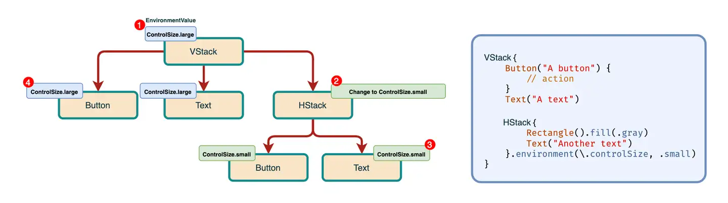
- 在根 View,SwiftUI 自动根据当前环境注入
@Environment(\.controlSize)。后续环境有变化,都会更新这个值,并在每一个监听@Environment(\.controlSize)都去重新计算 View body。 - 这里的
HStack通过environment(::)的方式修改值为.small - 在第二步里
HStack底下的直接和间接子 View,通过@Environment(\.controlSize)获取到的值,都是经过HStack修改的。 - 跟第二步的
HStack同级的相邻 View,读取到的依然是来自最顶层 VStack 的值。
如果你能理解上述的内容,那么对前文 SwiftUI 里 Button 的 ButtonStyle 的实现,可能已经有所了解了:
- App 启动并构造顶层 View 的时候,会根据当前系统设置的环境来定义
ButtonStyle的默认值——在 SwiftUI 这里,它的默认值是automatic。 - 要修改一个 View A 内直接和间接子 View 的 ButtonStyle,那么需要对该 View 调用
environment(::)来修改要往下传递的 ButtonStyle,假设为 plain。 - 那么 View A 内的直接和间接子 View,通过
@Environment(\.buttonStyle)拿到的指,就是 plain。
上述过程只是我的分析,ButtonStyle 这个环境值没有公开出来(也没必要,因为消费方是 Button 这个内建 View 自身),倒是 ControlSize 是有的,大家可以去官方文档看看。
那么在有以上基础知识后,回到上文的 CheckedButton 的例子,如何优化成这样的调用方式呢:
VStack {
    CheckedButton(checked: checked, labelText: "A checked button") {
        // action
    }
    CheckedButton(checked: checked, labelText: "Another checked button") {
        // action
    }
}.checkedButtonBackgroundColor(.primary)
    .checkedButtonIconForegroundColor(.white)
    .checkedButtonLabelForegroundColor(.red)
首先,我们需要一个「容器」来在 Environment 来存放这些可设置的属性值,当然你也可以一个属性值对应一个 EnvironmentKey,但这样比较费劲。
struct CheckedButtonStyle {
    let labelForegroundColor: Color
    let iconForegroundColor: Color
    let backgroundColor: Color
}
给它定义一个 EnvironmentKey:
struct CheckedButtonStyleKey: EnvironmentKey {
    static var defaultValue: CheckedButtonStyle {
        CheckedButtonStyle(labelForegroundColor: .white,
                           iconForegroundColor: .white,
                           backgroundColor: .accentColor)
    }
}
这里需要提供一个默认值。然后给 EnvironmentValue 提供一个扩展属性,方便使用 KeyPath 的方式来访问:
extension EnvironmentValues {
    var checkedButtonStyle: CheckedButtonStyle {
        get { self[CheckedButtonStyleKey.self] }
        set { self[CheckedButtonStyleKey.self] = newValue }
    }
}
接着需要实现一个 ViewModifier,来接收要修改的 CheckedButtonStyle 值,并把其跟来自 @Environment 的值进行合并:
struct CheckedButtonStyleModifier: ViewModifier {
    @Environment(\.checkedButtonStyle) private var checkedButtonStyle

    var labelForegroundColor: Color? = nil
    var iconForegroundColor: Color? = nil
    var backgroundColor: Color? = nil

    func body(content: Content) -> some View {
        content.environment(\.checkedButtonStyle, mergeStyle())
    }

    private func mergeStyle() -> CheckedButtonStyle {
        let labelForegroundColor = labelForegroundColor ?? checkedButtonStyle.labelForegroundColor
        let iconForegroundColor = iconForegroundColor ?? checkedButtonStyle.iconForegroundColor
        let backgroundColor = backgroundColor ?? checkedButtonStyle.backgroundColor
        return CheckedButtonStyle(labelForegroundColor: labelForegroundColor,
                                  iconForegroundColor: iconForegroundColor,
                                  backgroundColor: backgroundColor)
    }
}
对于 CheckedButtonStyleModifier,在构造的时候,只需要传入需要修改的值,未经修改的值为 nil,然后在跟 @Environment 合并的时候,来根据是否 nil 来做区分。
最后,给 View 添加扩展方法:
extension View {
    func checkedButtonLabelForegroundColor(_ color: Color) -> some View {
        self.modifier(CheckedButtonStyleModifier(labelForegroundColor: color))
    }

    func checkedButtonIconForegroundColor(_ color: Color) -> some View {
        self.modifier(CheckedButtonStyleModifier(iconForegroundColor: color))
    }

    func checkedButtonBackgroundColor(_ color: Color) -> some View {
        self.modifier(CheckedButtonStyleModifier(backgroundColor: color))
    }
}
原 CheckedButton 的实现里,读取 @Environment 的值:
struct CheckedButton: View {
    @Environment(\.checkedButtonStyle) private var style

    let checked: Bool
    let labelText: String
    let action: () -> Void

    var body: some View {
        Button(action: action) {
            HStack {
                // Omit for short
            }
            .background(Capsule().fill(style.backgroundColor))
        }
        .buttonStyle(.plain)
    }
}
这里省略部分代码,以 style.backgroundColor 作为例子来介绍如何读取环境值。
到此为止,对 CheckedButton 的改造已经完成。我们可以从任何地方调用 checkedButtonLabelForegroundColor 等方法来修改里面的 CheckedButton 的值。如果有新的可以设置的参数增加,那么上述新增的几个结构都要添加对应的属性,但是对于使用方来说,只是多了一个 View 的扩展方法而已,降低使用成本。
更多思考
回到这张图,我们可以看到,这个 EnvironmentValue 的传递方向,是从 View Hierarchy 顶层,从上到下传递的。那么,是否会有另一种传递方向呢?
我们看看另一个 SwiftUI 的 API 使用方式:
NavigationView {
    VStack {
        // ...
    }
    .navigationTitle("Page One")
}
NavigationView 是一个官方提供的导航组件,其中它能显示当前页面的一个 Title。设置当前页面的 Title,是通过 navigationTitle(_:) 的方法设置的。但是仔细想想,标题是在 NavigationView上显示的,而里面的 Content 只是告诉 NavigationView 当前的页面要显示的标题。
这种 API 的属性值流动方向,跟上文提到的刚好相反,是从 View Hierarchy 的某一个子 View,往上传递的。
要实现这种效果,我们需要用到 PreferenceKey API。
具体的实现方式,这里不贴出代码,使用文字来描述一下:
- 对需要通过这种方式往上传递的属性,定义一个
PreferenceKey。 - 在子 View 内,使用 preference(key:value:) 来给这个 Key 提供 Value。
- 在父 View,通过
onPreferenceChange(_:perform:)来监听这个PreferenceKey对应 Value 的变化,从而改变它自身的属性。
Subscribe to JuniperPhoton's Blog
Get the latest posts delivered right to your inbox