Flutter it up [01]
You may have heard of Flutter, a UI framework for crafting high-quality native interfaces on iOS and Android in record time. If you haven't, you should probably refer to the website to take a look.
This article concentrates on the development of a Flutter app, which would be my MyerSplash, a wallpaper client cross multi platforms including Windows 10, Android and iOS in progress.
Since Google has announced Flutter beta, I think it's necessary to start to learn the essence of it, especially of how the UI framework works.
Flutter comes with dart, you use dart language to write your UI code and also your business code. A Flutter project contains a lib module which the dart code are in, a regular Android module and an iOS module. You can choice to support Kotlin and Swift code instead of Java and Objc, but since you would probably write dart code at the most of the time, it doesn't really matter.
As for me, the most attractive part of Flutter is that we can distribute the same code to Android and iOS, tailor for each other and publish to the platform as a native app. You may have known that MyerSplash is a app supporting multi platforms, however I have to maintain 3 very different code and projects (C#/XAML for Windows, Kotlin for Android, Swift for iOS). Clearly this job is tiring. I think I should at least try Flutter and see if it can save me free from the work.
This is the first article of the series, recording the tour of designing and developing flutter app. You should know that I am no expert in Flutter, and if I do something bad or wrong, please feel free to let me know. Just so you know, I will just skip the installation of Flutter and the start-up procedure, which you should find it in the Flutter website.
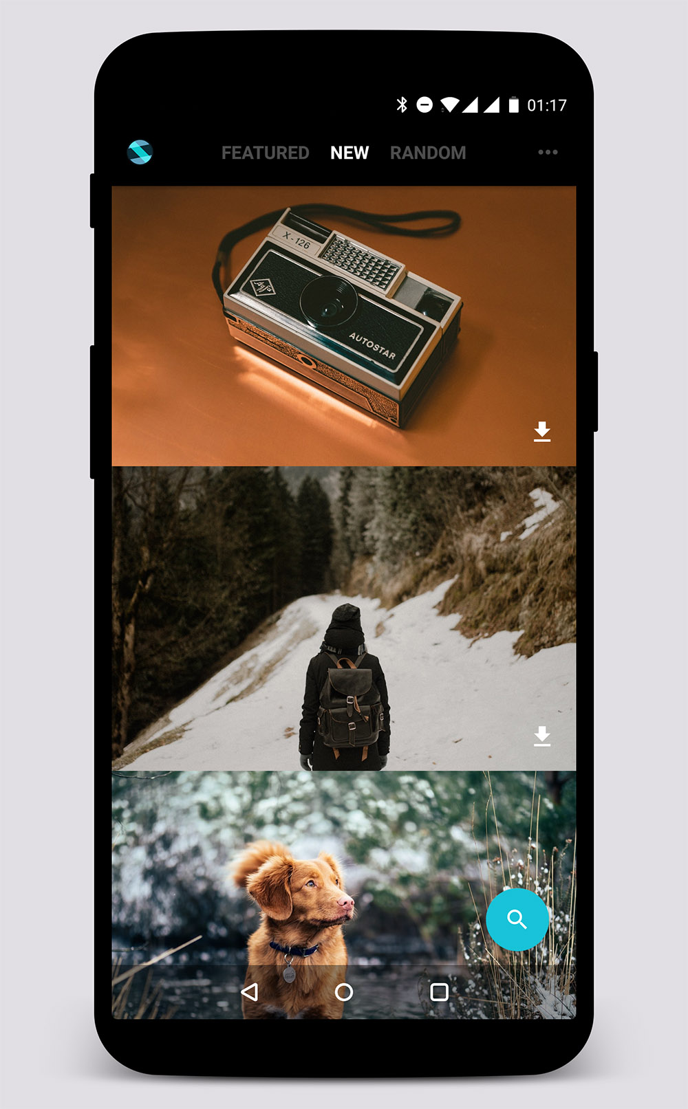
To keep it simple, I use the design of MyerSplash for Android. The first step of building MyerSplash is to build the main page's UI.
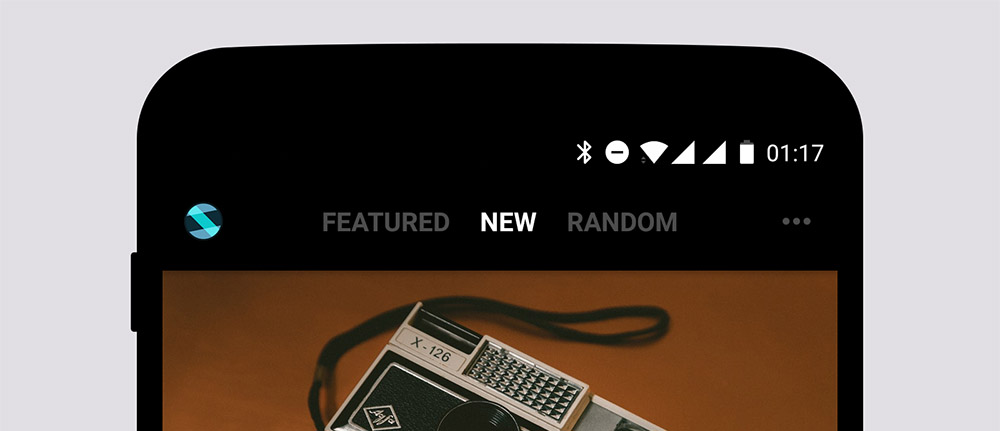
First take a look at the main page: it contains a custom title bar, a view pager as the content of images, and a FAB(aka Floating Action Button). We start by building the title bar.
Flutter is built with Material support, which means there are material-like widgets you can directly use. Since it's quite simple and you can find it in Flutter's sample app, we build our custom title bar and make it corporates with the content.
Anatomy of TitleBar
The screen below is the Android version of MyerSplash, it contains a logo on left, 3 tab titles in a central row, and a more button on right.
The 3 tab titles are corresponding to the content pages below, we use this style of tabs instead. If we are in the zero index of content pages, the first title is highlighted while other two are dimmed with 0.5 opacity. By tapping the title, the content pages will switch to the corresponding one.
In Android, you may write something like this:
<FrameLayout>
  <ImageView/>
  <LinearLayout>
    <TextView/>
    <TextView/>
    <TextView/>
  </LinearLayout>
  <ImageView/>
</FrameLayout>
While it's quite simple in Android, the same layout in Flutter is similar but the widget hierarchy is far more complex. You should understand the widget concept in Flutter: only it represents a simple visible ui element (View in Android or UIView in iOS), but also it represents some visual effect likes Opacity, Align, Center and so on.
Thus, in Flutter, before writing your UI code, you must craft the exact features your widget carefully: does it support changing the opacity, does it support gesture detection?
First we create a method to build the title text:
final TextStyle _titleTextStyle = new TextStyle(
    color: Colors.white, fontWeight: FontWeight.bold, fontSize: 15.0);

final EdgeInsets _titlePadding = new EdgeInsets.symmetric(
    vertical: 0.0, horizontal: 8.0);

const List<String> _titles = const <String>["FEATURED", "NEW", "RANDOM"];

Widget _createTitleWidget(int index) {
  return new GestureDetector(
    onTap: () {
      if (onClickTitle != null) {
        onClickTitle(index);
      }
    },
    child: new Opacity(
        opacity: index == selectedIndex ? 1.0 : 0.5,
        child: new Container(
            color: Colors.transparent,
            height: barHeight,
            child: new Center(
                child: new Text(_titles[index], style: _titleTextStyle)
            ),
            padding: _titlePadding
        )
    ),
  );
}
As you can see, we wrap the Text with Center to make it central to the container, and then wrap the Center with Opacity to provide the ability to change its opacity. And because we need to detect the tap gesture, we wrap all with a GestureDetector.
Just remember, while writing a widget, you are writing the snapshot of the UI. That's, according to Flutter, you can control each frame of your UI.
The code
opacity: index == selectedIndex ? 1.0 : 0.5
means that in the current frame, if the index equals to the selectedIndex, the opacity will be 1.0 or 0.5 otherwise.
Then we build the logo image with horizontal margin of 12:
new Container(
  child: new Image.asset(
      'images/logo_raw.png', width: iconHeight, height: iconHeight),
  margin: new EdgeInsets.symmetric(horizontal: 12.0),
  height: barHeight,
),
Note that
EdgeInsetshas some constructors to help us make insets. Just jump into the source code to take a look at those.
And then we build a icon appears on right:
new Align(
  alignment: Alignment.centerRight,
  child: new Container(
    child: new Opacity(opacity: 0.5,
      child: new IconButton(
          icon: const Icon(Icons.more_horiz, color: Colors.white70),
          onPressed: null),
    ),
    margin: new EdgeInsets.symmetric(horizontal: 12.0),
    height: barHeight,
  ),
)
NOTE:
Flutterhas built in material icons, which should save us from finding icons.
Finally we make those things up to a TitleBar.
Before we doing that, here is a question: is this widget a stateful or a stateless widget? Or think about this: can this widget changes its visual state itself or let its parent decide this?
In this context, I think it should be a stateless widget by throwing the selectedIndex the onClickTitle to its parent. The selectedIndex helps to decide the visual state of title text on drawing each frame of this widget. And we have a onClickTitle to notify the parent the user has tapped the text and you should do something.
The whole TitleBar.dart would be:
import 'package:flutter/material.dart';

typedef void OnClickTitle(int index);

class TitleBar extends StatelessWidget {
  final double barHeight = 66.0;
  final double iconHeight = 24.0;

  int selectedIndex = 1;
  OnClickTitle onClickTitle = null;

  TitleBar(this.onClickTitle, this.selectedIndex) {
  }

  @override
  Widget build(BuildContext context) {
    final double _statusBarHeight = MediaQuery
        .of(context)
        .padding
        .top;

    final TextStyle _titleTextStyle = new TextStyle(
        color: Colors.white, fontWeight: FontWeight.bold, fontSize: 15.0);

    final EdgeInsets _titlePadding = new EdgeInsets.symmetric(
        vertical: 0.0, horizontal: 8.0);

    const List<String> _titles = const <String>["FEATURED", "NEW", "RANDOM"];

    Widget _createTitleWidget(int index) {
      return new GestureDetector(
        onTap: () {
          if (onClickTitle != null) {
            onClickTitle(index);
          }
        },
        child: new Opacity(
            opacity: index == selectedIndex ? 1.0 : 0.5,
            child: new Container(
                color: Colors.transparent,
                height: barHeight,
                child: new Center(
                    child: new Text(_titles[index], style: _titleTextStyle)
                ),
                padding: _titlePadding
            )
        ),
      );
    }

    return new Container(
        padding: new EdgeInsets.only(top: _statusBarHeight),
        height: barHeight + _statusBarHeight,
        color: Colors.black,
        child: new Stack(
          children: <Widget>[
            new Container(
              child: new Image.asset(
                  'images/logo_raw.png', width: iconHeight, height: iconHeight),
              margin: new EdgeInsets.symmetric(horizontal: 12.0),
              height: barHeight,
            ),
            new Center(
                child: new Row(
                  mainAxisSize: MainAxisSize.min,
                  crossAxisAlignment: CrossAxisAlignment.stretch,
                  children: <Widget>[
                    _createTitleWidget(0),
                    _createTitleWidget(1),
                    _createTitleWidget(2)
                  ],
                )
            ),
            new Align(
              alignment: Alignment.centerRight,
              child: new Container(
                child: new Opacity(opacity: 0.5,
                  child: new IconButton(
                      icon: const Icon(Icons.more_horiz, color: Colors.white70),
                      onPressed: null),
                ),
                margin: new EdgeInsets.symmetric(horizontal: 12.0),
                height: barHeight,
              ),
            )
          ],
        )
    );
  }
}
NOTE
This line of code
typedef void OnClickTitle(int index);
means we define this kind of function (which is, with one int argument and nothing to return) as a type named OnClickTitle. Remember, function in dart is a first-class citizen.
The widget on top of screen is extended to the status bar by default, which means that we should leave a space with height of status bar to layout the child of the root widget of title bar.
We can retrieve the status bar height by doing this:
final double _statusBarHeight = MediaQuery
    .of(context)
    .padding
    .top;
Build the app
import 'package:flutter/material.dart';
import 'app_color.dart';
import 'title_bar.dart';

void main() => runApp(new MyApp());

class MyApp extends StatelessWidget {
  @override
  Widget build(BuildContext context) {
    return new MaterialApp(
      title: 'MyerSplash',
      theme: new ThemeData(
        primaryColor: AppColor.themeColor,
        primaryColorDark: AppColor.themeColorDark,
        accentColor: AppColor.themeColor,
      ),
      home: new MainPage(),
    );
  }
}

class MainPage extends StatefulWidget {
  MainPage({Key key}) : super(key: key);

  @override
  _MainPageState createState() => new _MainPageState();
}

class _MainPageState extends State<MainPage> {
  int _selectedIndex = 1;

  void _handleOnClickTitle(int index) {
    setState(() {
      _selectedIndex = index;
    });
  }

  @override
  Widget build(BuildContext context) {
    return new Scaffold(
      body: new Container(
          color: Colors.black,
          child: new Column(
            mainAxisSize: MainAxisSize.max,
            children: <Widget>[
              new TitleBar(_handleOnClickTitle, _selectedIndex)
            ],
          )
      ),
      backgroundColor: Colors.black,
    );
  }
}
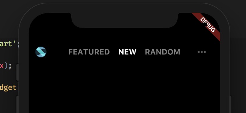
Now we run in a iPhone X simulator:
NOTE
We pass the _handleOnClickTitle method as the argument named OnClickTitle while constructing the title bar, giving the _MainPageState ability to do the business. Currently we just update the UI by calling setState() method, which will cause Widget build(BuildContext context) to called in the future to build the new widget for the next frame.
Next
As the first one of the series, I should keep it short.
In the near next post, I am going to talk about the implementation of ViewPager like widget and how it coordinate with the title bar. Feel free to subscribe this blog to get notification.
You can find the complete code to run on GitHub.