Flutter it up [02]
The last post we talk about building a title bar, and this time, we focus on the content view.
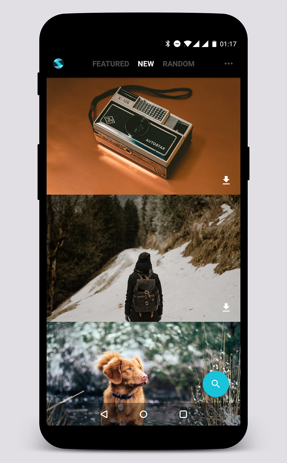
Let's check out the app structure: it contains a title bar which we already had, a scrollable content area and a floating action button. We should first think about how to organize those things up.
First of all, Flutter provides a widget that implements the basic material design visual layout structure as it says named Scaffold. Its name is quite strange but it's indeed powerful. Since we use our custom title bar, we don't need its AppBar field. It has a floatingActionButton field so we can assign it with a new FloatingActionButton object:
floatingActionButton: new FloatingActionButton(
  onPressed: _onPressedFAB,
  tooltip: 'Search images',
  child: new Icon(Icons.search, color: Colors.white),
),
Just remember that Flutter has builtin material design icons saving us from finding them.
Currently we have _MainPageState like this:
class _MainPageState extends State<MainPage>
    with SingleTickerProviderStateMixin {
  int _selectedIndex = 1;

  void _onPressedFAB() {
  }

  void _handleOnClickTitle(int index) {
    setState(() {
      _selectedIndex = index;
    });
  }

  @override
  Widget build(BuildContext context) {
    return new Scaffold(
      body: new Column(
        mainAxisSize: MainAxisSize.max,
        children: <Widget>[
          new TitleBar(_handleOnClickTitle, _selectedIndex),
        ],
      ),
      backgroundColor: Colors.black,
      floatingActionButton: new FloatingActionButton(
        onPressed: _onPressedFAB,
        tooltip: 'Search images',
        child: new Icon(Icons.search, color: Colors.white),
      ),
    );
  }
}
We stack the title bar and the content area in a Column widget, which is the body of Scaffold. Now we need a content area right next to the TitleBar, and it should take up all the leaving space in Column. In this case, a Expand widget is needed:
A widget that expands a child of a
Row,Column, orFlex.
Inside the Expand, it should be ViewPager equivalent widget. In Flutter, it's TabBarView. By constructing TabBarView, we must assign its children of course and its controller.
What's a tab controller? Well, it coordinates tab selection between a TabBar and a TabBarView. The TabBarView normally works together with TabBar, and those widgets are connected by TabController. If you are using the two widget both, DefaultTabController is the best and simple choice.
However, again, we use our own title bar, thus, we have to manage the tab view and its tab controller on our own.
By reading the comments on TabController, we should know the typical way to deal with it: construct the controller in State's initState() method and dispose it dispose(), and while building the TabBarView widget, we assign the controller to it.
class _MainPageState extends State<MainPage>
    with SingleTickerProviderStateMixin {
  int _selectedIndex = 1;
  TabController _controller;

  @override
  void initState() {
    super.initState();
    _controller = new TabController(
        length: 3,
        vsync: this,
        initialIndex: _selectedIndex);
    _controller.addListener(() {
      _handleOnClickTitle(_controller.index);
    });
  }

  @override
  void dispose() {
    _controller?.dispose();
    super.dispose();
  }

  void _onPressedFAB() {
  }

  void _handleOnClickTitle(int index) {
    setState(() {
      _selectedIndex = index;
    });
    _controller?.animateTo(index);
  }

  @override
  Widget build(BuildContext context) {
    return new Scaffold(
      body: new Column(
        mainAxisSize: MainAxisSize.max,
        children: <Widget>[
          new TitleBar(_handleOnClickTitle, _selectedIndex),
          new Expanded(
              child: new TabBarView(
                controller: _controller,
                children: <Widget>[
                ],
              )
          )
        ],
      )
      backgroundColor: Colors.black,
      floatingActionButton: new FloatingActionButton(
        onPressed: _onPressedFAB,
        tooltip: 'Search images',
        child: new Icon(Icons.search, color: Colors.white),
      ),
    );
  }
}
You may have noticed the new mixin feature in dart:
class _MainPageState extends State<MainPage> with SingleTickerProviderStateMixin
I am not going to give a long talk about it since it's also new to me. In this case, you can understand by this: _MainPageState can use any methods defined in SingleTickerProviderStateMixin, and _MainPageState is also a TickerProvider since SingleTickerProviderStateMixin implements it. It's like SingleTickerProviderStateMixin is a companion to _MainPageState.
To know more about the mixin feature, refer to the official document.
NOTE: in this case the fact that we don't use DefaultTabController is for a reason. DefaultTabController is a stateful widget managing its own state. And of course it maintains a TabController inside, which means that we are not about to listen to the index changed of TabController unless this class provides to us, however it doesn't. Thus we create our own TabController and add listener to it:
_controller.addListener(() {
  //todo
});
Inside the listener, we should update the title bar by calling setState() method, the build(BuildContext context) method will be called in the future and the title bar's visual state will be up-to-date.
Above we talked about how to build a TabBarView, however, the children field in TabBarView is still empty. The next post we are about to build a ListView and send a http request to obtain images to display. Stay tone and come back soon to see hot it's done.